What is Great Web Design? | Photo by Debs (Creative Commons)

Most of us have created our own website for our small business or hobby without any formal design school training. Web design is one of the only classifications of design where we routinely cut out the professional and opt to do it ourselves. We wouldn’t be our own architect, interior designer or product designer if we didn’t have the skills to do the job, right? Unlike in architecture, if we screw up a website we don’t have to worry about the whole ceiling falling down on our heads. That’s not to say that damage can’t be done. A poorly designed website can cause your visitors to question your professionalism and experience. It can make navigation difficult. It can leave a bad first impression and it can cause you to actually lose business and credibility.

I can’t teach you how to make a beautiful website in one blog post, but I can teach you some tricks I learned in design school that have carried me though my career as a professional designer these last 15 years. If you are a professional design, you’ll recognize these. They are the 5 Commandments of Web Design and they can be used  by even novice web designers to make smart decisions about the look and feel of any website.

Rule No. 1 – There are No Arbitrary Design Decisions.

I still use this statement in my design work on almost a weekly basis. Professional designers do not make arbitrary decisions… ever. Every decision is based on research or to support a concept or theme. When you begin to conceive of your website ask yourself, “who am I creating the site for?” Then ask, “what would these people want to see in a site like mine?” If you are creating a site for your photography business, for example, you know that your site visitors are, above all things, going to want to see your photos. Right off the bat you know that your photos should be front and center. You’ll have to decide what the background color of your site will be. You may select black because it makes your photos pop. You may want to go neutral so as not take away from any of your images. You may choose white if your research tells you that clients trust sites with a white background above other colors. Any of these decisions are valid options because they are based on a motive. Choosing a green background  because it’s your favorite color is not a reason. In design school, professors constantly question the motivation of their students decisions. Like a three year old child they will ask, “why…why…why…why.” so many times that eventually some student will crack and admit they didn’t have a reason for something. I’m pretty sure professors love this moment of weakness because they can use the folly to teach the entire class (through public humiliation) about Rule No. 1 – There are no arbitrary design decisions… (and maybe because they are a little sadistic.)

Keep an eye out for these common web design decisions that might be arbitrary:

  1. Background color
  2. Font selections
  3. Button graphics
  4. Highlighted text. Use of bold or colored text.
  5. Wording of page titles (should be researched based)
  6. Inclusion of widgets, polls, date stamps or stat counters
  7. Priority of navigation bar elements
  8. Use of indentations, bullets, columns, and other page attributes

Rule No. 2 – Because “I Like it” is Not a Reason.

Your Font Says A Lot About You | Image by FontShop (Creative Commons)

This is a subset to  Rule No. 1. The majority, but not all, of arbitrary design decisions are based on personal preference. I’ve even been guilty of it from time to time. I’ve never really liked the color teal. I love blue and I love green, but when you put them together it just seems, “meh” to me. Sometimes my fellow designers will assemble color pallet for a design project we’re working on that features teal. My first instinct is that I don’t like it. I have to stop and ask myself, “is this color not appropriate for the project or is this just my personal preference coming into play?” My coworkers are amazingly talented and have a great eye for color. Typically, the issue here is personal and the color is actually completely appropriate for the project. Most of the time, the decision is to add something or “enhance” something with your own personal style. I see this rookie mistake all the time. Here’s an example, let’s say you are creating a website for your neighborhood’s Co-ed Kickball Club. Pink is your favorite color so you decide to go with that as the accent color on your website. What you didn’t think about is that the pink site is making the guys feel the club isn’t really for them and they move on to join another club competing for your members.

Rule No. 3 – Less is More.

When You Can't Decide. Go Helvetica. | Photo by J. Kleyn (Creative Commons)

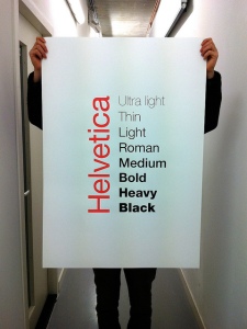
We have Mies van der Rohe to thank for this little jewel of modernist philosophy. What designer hasn’t used this adage at some point in their career? You’ve spent hours trying to pick out the perfect fancy script font. Some are too loopy, some impossible to read, some don’t quite connect the “s” to the “t” just right. So what do you do? You know what… You abandon it all and go back to Helvetica. Why? Because sometimes less really is more. Nothing quite ruins a website like unnecessary clutter, inconsistent page styling, or competing graphics. If you’re not sure, simplify it. The more complicated it is, the easier it is to screw it up.

Rule No. 4 – Show Only Your Best Work.

This is the cardinal rule of design portfolios. Our heart tells us to show everything we have worked so hard to produce. Whether it’s our art, writing, music, or photography, we want to show it all. Design professionals will tell you this is a mistake. You can’t take back a first impression, so make sure you are only putting your best work out there. If you are a writer, you don’t need to publish your personal journal. If you’re a photographer, leave Grandma’s 85th birthday photos on your private Flickr page (unless they are absolutely stunning.) Not all websites are creative in nature. Even if yours is about how to bake a cake, fix a carburetor, do your own taxes, or floss properly always put your best foot forward. This means you are checking your writing for spelling and grammar mistakes, providing working hyperlinks, and never-ever posting out of focus or pixilated images.

Rule No. 5 – Work Smarter, Not Harder.

This rule isn’t one that they teach you in design school. It’s usually not even one they teach you on the job. Working smarter, not harder comes only when you’ve hit a wall. When you realize that putting in long hours for little gain may not be worth your time. How does this apply to web design? Let me tell you. There is little reason for someone who needs a website for their small business or niche website to learn how to build one from scratch. If you are interested in it, by all means, give it a shot. It certainly doesn’t hurt. BUT… if all you need is a website to represent yourself or your business, then I encourage you to take advantage of the cheap (sometimes even free) website templates available. For somewhere between $20 and $80 you can buy and install a gorgeous website template all by yourself. A web template that is set up to optimize your site for SEO from the get-go and that is more technologically sophisticated than anyone new to HTML will ever be able to develop for themselves. My favorite places to buy website templates are  ThemeForest and Template Monster. Nearly all of them are customizable to some degree so you can add your own logo and choose page layouts that suit your purpose. Many even allow you to change the colors, look, and feel of the site without any knowledge of HTML or CSS. What makes them cheap is that the web designer is selling multiple copies as a template instead of a fully custom website made just for one client. Yes this means that someone else may have the same site template as you, but once you add your own logo, name, and color scheme, it’ll have a personality all of its own.

Know When to Walk Away... No When to Run | Photo by Andy Mangold (Creative Commons)

The same goes for graphics and branding. You’ve heard the saying, “do your best, farm out the rest”? If graphic design and branding is not your forte, hire someone who can help you. Yes, graphic designers do cost money, but doing a mediocre job designing your logo or web graphics can actually hurt your business. If you’re not quite ready to invest in a designer, you can also buy inexpensive vector art through sites like Fotolia, where you can purchase the graphics and the right to reproduce them for less than $10 (in most cases). For even less money, you can purchase the high resolution jpeg files to use on your site without requiring the photo rights and attribution requirements of some of the free sites like Flickr. Of course, if free images are the only images you can afford, Flickr is your friend. Just be sure to carefully understand the Creative Commons requirements that go along with each photo and keep a copy of all email correspondence you have with the photographers.

Here’s a fun fact: The SEO Sister logo was developed from artwork bought off Fotolia. For just a few bucks and about 15 minutes on Adobe Illustrator, I had a shiny, techy logo that reinforced what SEO Sister is all about. Fun with technology, education, fresh and current content, and of course, girl power in the Web Marketing and Social Media industries!

Websites, by their very nature, are an artistic media. They are a blank canvas where we compile code to create a collage of text, graphics, photos and animation. Even if you’re not a trained designer, you can think like one by using these design school guidelines.

Got your own rules for good website design? Share them in the comments.

Want more helpful tutorials? Check out the SEO Sister Channel on YouTube

How is a Facebook Landing Page Different from a Facebook Account?

Christie Mayer, your SEO Sister here to talk to you today about how to create a Facebook Page for your small business or website.

Here we are on Facebook. I’m looking at the Rubios Facebook Page. You know it’s a Page because right here, at the top, it has a “like” button. You can’t “like” an account. You can like a Page; however, there is a difference.

A Facebook Page is different from a Facebook account. A Page represents a business, an organization or website specifically. You will need a standard Facebook account or a business account already to start your Facebook Page or you can begin creating your Facebook Page and go back later to create an account. Either way, you will need an account in order to set up a Facebook Page. At its simplest, it is a place where a business can put its logo and some information about it. If I click on “Info” you can see a section called “About”, it can show a mission statement, talk about its services, its hours of operation, and of course, its email and website information. Most importantly it is a place where fans of that business, organization, or website can come and publicly “like” it and can endorse it. They can do that either through your website, where you can place the “like” button or they can do it on your Facebook Page, where they can go in and say that they like your business.

Here is Rubios Page, one of my favorite Mexican food restaurants. I’m going to “like” them by hitting the button so you can see how that works. This is a pretty detailed example of a Page. They have their “Wall” where they can leave announcements and updates and where people can comment. They have their locations, general info, and a bunch of other things. Now you don’t have to have all this stuff on yours. If you don’t have a lot of time to put into your Facebook Page, that’s perfectly alright. You can make it as complicated or as simple as you want.

Create a Facebook Page for a Website or Blog

We’re going to go ahead an create a Facebook Page for SEOsister.wordpress.com, my blog. In order to do that, I am already logged in and I need to go to Facebook’s Page set-up area. In order to do that you can go to http://facebook.com/pages/create.php. It’s going to bring to the “Create a Page” screen.

If you are a brick and mortar building or a small business with a  physical location, you can use this “Local Business or Place” form right here in the upper left. It will ask you to choose a category for what your business is about, then you can add in your address, your city and state and your phone number. SEO Sister isn’t a brick and mortar building, nor is it a company or organization. If you are a company or organization you can use the middle button, which is very similar, but doesn’t give you a place to put your physical address.

Since I’m doing this for my blog, I’m going to choose the button for “Brand or Product.” I’m going to select the category, “Website” and then I’m going to name my Page. In this case my “brand” or website is called, “SEO Sister.” I’m going to “Agree” to Facebook’s terms and then select, “Get Started.”

It’s going to bring me to this “Upload an Image” page where I can put a logo. I’m going to do that in a minute. I’m going to skip this for now. You can always go back and do this stuff later, so don’t be afraid to skip ahead. It’s going to ask me if I want to invite any friends or share my Page with. Again, I can do that later. I don’t have to worry about that now or at all if I choose not to. So I select “skip” and it takes me to step three, “Basic Info”, where it it is going to ask me for my website, which is very important since my Page is about my site. I’m going to enter in my website address. Then it gives me a little place here, for 255 characters, where I can put in an “About”. This is a place where I can put in a little blurb about my company or maybe a slogan. Again, I can add that later.

Then you get to the main page. It shows me in the corner. I am the “Admin.” This Page is tied to either my personal account or my business account. In this case, I have a personal account. Every Page has to have an Admin, which is usually going to be the business owner or whomever is handling the business’s website.

Here is a little information as to how the page is laid out. You’re going to get your notifications here, so if someone “likes” you a notification will pop up. Whenever someone leaves you a message, you can get notifications for that too. You can get some statistics or go into “Advertising” if you want to.

Over on the left, the “Get Started” button allows you to get going with some of the set-up options like adding an image. Let’s go ahead and add an image. I’m going to select the “Browse” button and select an image from my computer. Select the button… and there’s my logo. You can see that it changed it over here on the left.

You can see over here in the upper right is the “Edit Page” button. This is going to give you all the options you have. It’ll take you a little time to go through it but you can see all that there is.

There is “Permissions.” You can see that anyone, 13+ can view my website. In the “Wall” tab you can show “All Posts” or “Only Posts by the Page.” There are a lot of options in here.

If you go to “Basic Information” this is really helpful. This is one of the first things you’ll want to check out. I’m a “Website and Blog” so I’m going to want to change that in the “Category” tab. Now let’s see what my options are. “Computers and Internet,” that’s me. I can also select a “Community Page,” which is a Page that already exits and list that here, but I’m not going to that now. I can put in my “Release Date” which is the date I went live. For me that was 2011. Here’s that place where you can go back later and add information about your business, organization or website. You can do more detailed information in the “Description.” You can tout your awards and brag a little here. There is a place for your email address if you want people to be able to contact you. At the bottom is where your website address goes.

Once again, if you ever want to change you profile picture you can select, “Profile Picture,” here. There are a few more options for you to look through. You can set up your mobile device and you can look at statistics but that’s the basics of it.

Once you are done getting all your information in you can select, “View Page”. You can always go back and update it or change it at any time. Here’s the “Info” tab. It is the main page. It will be the place where all that “About” information will go once I fill it in. Right now it is very simple. It just has my website address. Your “Wall” is here. It is where my fans, once they start “liking” me, can leave me messages. I can make announcements here, I can link to blog posts and let all my fans know there is new information on my website. If I were a business, I could put some promotions here and share it with the fans of my business.

How to Access you Facebook Landing Page from your Account

You might wonder how to get back to your Page later. I’m going to click back to my standard Facebook account. When you want to find your Page again later you just log into your standard Facebook account. There is a little arrow in the upper right. Click it and it says, “use Facebook as a Page.” When you want to get back to your Page, just select “use Facebook as a Page” and it will show you all your Pages. You can see that I have two pages. You can see our new SEO Sister Page right here. You just select, “Switch” and it brings you right back. Keep in mind, this “Get Started” page is something only you can see. When your fans click the Page, they wont’ see this, “Get Started.” They will go directly to your “Wall” or your “Info” page, depending on how you set it up.

That’s about it. That is all there is to setting up a Facebook Page for your small business or your website.

How to use anchor text

Anchor text is a type of link commonly used in the content portion of websites (as opposed to the navigation bar or footer). When you are writing a paragraph you may find it useful to link a keyword or phrase to another page, either to your own website or an external site. Anchor text are those specific words you have chosen to attach a hyperlink to.

Search engines put a lot of value on anchor text. Since the links are located right inside the “meat and potatoes” of your website, the content portion, the search engines assume it must be important. It looks at the keyword or phrase you have chosen to be identified and associates that keyword/phrase with the link. Choosing valuable keywords is important.

Example of bad anchor text

“Click here to check out our totally awesome new page on the Basics of SEO.”

In this example, the word “here” is the anchor text and has nothing to do with the Basics of SEO. This is useless anchor text.

Example of good anchor text

“Check out our totally awesome new page on the Basics of SEO.

In this example the phrase “basics of SEO” have been selected as the anchor text. This is a much better way to link text. Now the search engines are associating the phrase with the link.

Alt Tags for Anchor Text

Sometimes you just can’t make the sentence flow correctly with your targeted keywords. Here’s an example.

“SEO is totally awesome. Check out our page to learn the basics.”

In this case it might be difficult to decide exactly which word you want to attach your link to. Perhaps the keywords you are targeting don’t fit eloquently in the sentence. Of course, you want to write content that is easy to read for your human visitors. Google bots are secondary. In this case you can use “Alt Tags” in your anchor text. These work exactly like alt tags for photos. The alt tags attribute a different keyword or phrase to your anchor text than what your visitor sees.

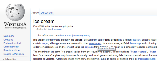
Here is a partial screen shot from Wikipedia’s page about Ice Cream. You can see they use a lot of anchor text on this page (everything in blue). Every one of their anchor links has alt tags that reference the title of one of their Wiki pages. You can see in the example, the article references the word “sweeteners” but when you hover over the word you can see that the alt tag says, “sugar substitutes”. If you click the link, it takes you to Wiki’s page about “Sugar Substitutes.” In this case sweeteners sounded better in the sentence (to humans) but the Google Bots saw, “sugar substitutes.”

Partial Match Anchor Text

Partial match anchor text is when just one word or a portion of your anchor text phrase contains your keyword (rather than the entire thing) or the targeted keywords are all there, but not in order.

Let’s take sugar substitutes as our example again.

Direct Match:sugar substitutes” the keywords match exactly.

Phrase Match:icecream sugar substitutes” the exact keywords are used in a phrase with the word icecream.

Partial Match:find a substitutes for your sugar” both words are there but they are out of order.

Partial Match:ingredients include sugar” one of the keywords is in the anchor text phrase.

SEOmoz did a ranking factor study that showed partial matches were significantly more power and had more correlation between the number of partial match anchor text than exact match anchor text. With statements like that, partial match anchor text may be well worth considering.

Here is SEOmoz’s video explaining more about Partial Match Anchor Text vs. Exact Match Anchor Text

Dos and Don’ts of Anchor Text

  • Do use anchor text to point to other pages on your site or relevant external sites.
  • Don’t use anchor text just because you can. It’s a helpful way to point your visitors to relevant information without losing the flow of your sentence.
  • Do select keywords relevant to your site’s content.
  • Do not link to words like “click here.”
  • Do lower your bounce rate by using anchor text to help your visitor find other relevant information on your own website.
  • Don’t encourage your visitors to leave by linking to a lot of external pages. Keep external page links limited and try to focus them lower on the page. Use TARGET=’_blank’ to open a link in a new browser window when appropriate.
  • Don’t try and fool your visitors by linking to something they weren’t expecting.

Deciding on a domain name for your website or blog can be a real challenge. There are a lot of factors to consider that can affect how visitor and search engines view your site.

Keyword Research

What would people type into the search engines to find a site about your topic? Jot down 10 – 20 keywords and then do a little keyword research to find out which are the most popular terms and which have the least competition (i.e. least number of sites vying for that same keyword or phrase). To evaluate keywords, I like to use Google’s Keywords Tool.

Take three or four keywords or phrases and configure them into a name you like. You will then have to check domain availability to see if any of the potential domain names you came up with are available for purchase. Google favors keyword-rich domains. You are more likely to rank higher in the Search Engine Results Pages (SERPs) for a keyword or phrase if it is part of your domain name. That’s why, when you type, “ride a bike” in the search engines, rideabike.com is at the top of the results page. Google’s Blog Search highlights  the top three blogs by keyword and locates them right at the top of their results page. These recommendations always have the keyword in the blog domain. I have found that the blogs highlighted at the top of the page aren’t always the best representation on the subject. Unfortunately, Google’s Blog Search puts more emphasis on domain name than it does content in this circumstance.

If you are finding that all your domain name ideas are already taken you can try sites like Domjax.com which will give you some suggestions that are available.

Google Blog Search

Google Blog Search Structure | Click to Enlarge

Branding

Branding is important for businesses as well as for niche sites. If you have a business you may choose to reinforce your brand in your domain name. For example, if you own Jill’s Bicycles you could register jillsbicycles.com or bikesbyjill.com. Tying your domain name to your company name helps to reinforce your brand. Plus, there is always going to be a percentage of people who will assume your website is your company name. These people will automatically type the URL jillsbicycles.com without ever going to a search engine. This is a good reason to research your competition and buy your website before you even name your business (if possible). For niche sites branding is important too, though you may have more flexibility in your domain name. Let’s pretend your name is Jill and you are creating a website that teaches people how to ride a bike. If “ride a bike” is the keyword phrase you are targeting, you could register the domain, rideabikewithjill.com. This incorporates your keyword and is unique and easy to remember, which are important aspects to successful branding.

Domain Name Structure

When naming your domain, try to keep it short and sweet. Shorter names are easier to remember and easier to type. Avoid hyphens and symbols in your domain name. Learntorideabike.com is far more successful than learn-to-ride-a-bike.com. Even though the hyphens make it easier to read, it actually makes it harder to communicate. Imagine someone on the telephone asking you for your website. It’s quite a mouthful to say, “learn hyphen to hyphen ride hyphen a hyphen bike dot com.” Also, there is some speculation that Google may penalize websites for having too many dashes or underscores. They tend to look a little spammy.

Domain Extensions (.Net, .Info, .Biz)

Choosing a Domain Extension

Graphic by: Ivanpw (Creative Commons)

Buy the dot.com. Believe it or not, there are a lot of people out there who don’t even realize there are other options. You will lose some traffic to people assuming your site is dot.com and going there instead of your site. If your competition has the dot.com already, you will actually be hurting your traffic stats and helping theirs. Years ago, before I got involved in SEO, I purchased nippyfish.net because nippyfish.com was taken. I was adamant about having the domain name. A couple of years later nippyfish.com opened up. I didn’t hesitate to purchase it. I worked really hard to make nippyfish.net successful and it has been, but I know I have lost visitors because I went with a dot.net instead of a dot.com. I still haven’t found the time to set up nippyfish.com to redirect to it to my site. I suspect when I do, I will get a significant jump in traffic. I’ll be sure to post the results when I get to it.

If you are a business, having a dot.com is even more vital. There is the perception that dot.com is more professional and legitimate. It is sort of a popularity contest, but in business popularity is very important.

Register Multiple Domains

Domains are relatively cheap (less than $20 per year). A lot of the best site names are taken and sometimes it requires a fair bit of creativeness to come up with a good domain name. If you find a couple of names that make you think, “oh my goodness, I can’t believe that is still available,” then buy them. If you own jillsbicycles.com for your business and you learn that rideabike.com is free, you can use it to host a blog or other informational site that can backlink to your business site.  Also, if you have a strong brand name, like Jill’s Bikes, you may want to buy some of the other domain extensions like jillsbicycles.net and jillsbicycles.biz so that you have control over what happens to those sites, giving you a little more brand protection.

A lot of small business owners make the mistake of thinking  they don’t need a website because they don’t sell a product online. With the average American spending 13 hours per week online (2010 statistic), the web has become an integrated part of our lives. We have access to it at work and at home and on our cell phones, making the internet available at our fingertips nearly every moment in the day.

Number of Websites in the World

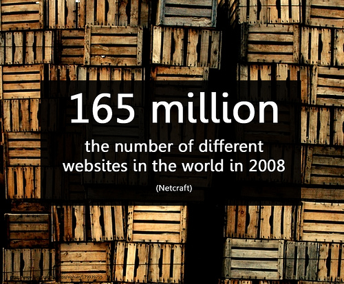
Image by Will Lion (As of 2010, there were 255 Million Websites)

Advantages to having a website for your business

Contact Information

Phone books are a thing of the past. In recent years many cities have been offering an opt-out program for residents that no longer use phone books. Cities like San Diego are taking it one step further and offering an opt-in program. There has been such an outcry from residents who no longer want the antiquated phone book, that the only way they will receive one in San Diego is by calling and requesting one. While some small business can rely on automatically generated listings online, they have no control over their accuracy or update schedule. Many small business don’t show up on internet listings at all. If nothing else, business should have a simple website identifying the service they provide and their contact information.

Company Branding

One of the nicest things about websites is that they are well suited to reinforce branding. Business owners put a lot of effort into developing their brand, which may include their logo, marketing material, the physical space, and even company culture. All or some of these elements can be incorporated in a website through graphics, photos and text. Websites are capable of reaching more people than virtually any other medium.

Your Competition

I was shocked to read that as of 2009, 46% of small business owners still didn’t have a website. I, like many Americans, do nearly all my shopping research online. Whether I am picking a restaurant for dinner, deciding where to get my nails done, choosing an auto shop, or picking a doctor, it all starts as online research. It’s hard to believe that I overlooked 46% of businesses because they didn’t have a website. What does this mean for small business owners? It means that your competition, more likely than not, does have a website and that gives them the advantage.

ROI

An effective website does not have to be expensive. Your own domain name and web hosting can cost less than $100 per year. These days you don’t have to be a programmer to create a professional website of your own. There are amazing free or cheap templates ($20 – $80) available to get you started. If you aren’t willing or able to do the work yourself you can hire a web designer to do it for you. The cost to have a web designer do the work varies on the site’s complexity and the experience of the web designer but it usually falls between $1500 – $3000. You can save money by having the web designer use a template instead of creating a fully custom site from scratch.  Ask your web designer for other ways to meet your budget and don’t be afraid to shop around.

If you don’t create your business website, someone else will.

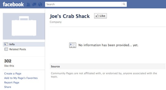
Websites like Facebook and Google are providing information on your business already. Facebook, the most popular website in the world with over 1 billion hits, now lists businesses by name. As a business owner, you can add your company’s contact information to Facebook’s business page driving traffic to your own site and encouraging Facebook users to publicly endorse your service or product. Business owners that don’t take advantage of this free advertising get a default, “No information has been provided” on the page endorsing their business. Popular sites like Yelp.com allow consumers to rate and review their favorite stores and services. Google Maps not only replaces the phone book with company contact information, they identify the business on a map and link to customer reviews. It is becoming increasingly more common for consumers to turn to the web to locate a business, read a review, and print a map and directions before they go there. One thing these sites all have in common? They include a link to businesses’ websites.

Facebook's Company Page

Default Facebook Company Page

Creating a website for your small business gives you control. Whether you want them to or not, people are likely talking about your business online. People share their experiences on review sites, through social media, on blogs, and in news articles. Having a website gives you control to provide only the information you want to share. This may include product endorsements, marketing information, client satisfaction information, etc. Only you have your company’s best interest in mind, so make sure your website is at the top of the search engine results rather than a review by a disgruntled customer.